HOME /
PORTFOLIO /
Le Soleé

Project Overview
How UX/UI design transforms complex challenges into usable and effective digital solutions
CLIENT

COUNTRY
ITALY
INDUSTRY
E-COMMERCE
SERVICE
BRANDING
UX/UI DESIGN
DEVELOPMENT
Le Soleé is a contemporary fashion e-commerce brand specializing in curated designer collections for men and women. The goal of this redesign was to elevate the digital identity of the brand, improve product discoverability, and enhance the shopping experience through visual storytelling and functional clarity


From Challenges to Solutions
A closer look at the problems we faced — and how thoughtful design helped solve them
Identified Problems
Weak visual identity
The previous website looked outdated and failed to reflect the aesthetics of a modern fashion brand. The lack of compelling visual storytelling and a cohesive style lowered trust and engagement
Complicated navigation and structure
Categories and filters were overloaded or unclear, making it difficult for users to navigate or find what they were looking for. The catalog lacked engagement and did not motivate exploration
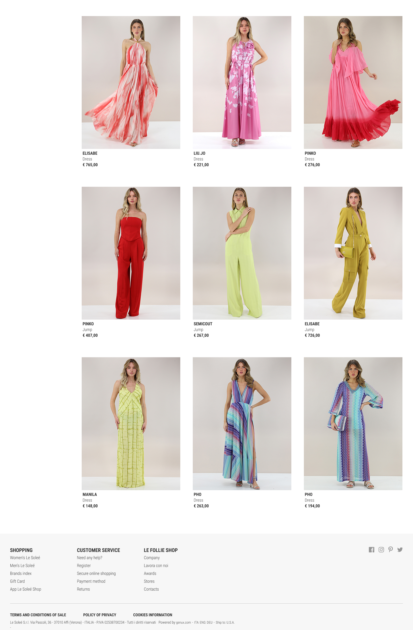
Poor product presentation
Product cards didn’t convey value: no gallery, large visuals, or contextual views. Users couldn’t clearly imagine the product, reducing their motivation to purchase
Unoptimized mobile experience
The site performed poorly on mobile: clunky filters, tiny elements, and an awkward cart interface. This was especially critical for fashion e-commerce where most traffic comes from mobile users
Unengaging Hero Section
The initial screen failed to capture attention or guide the user — it lacked focus on categories, seasonal collections, and aesthetics. Visitors had no clear visual direction from the very first moments
Implemented Solutions
Visual identity redesign
A clean, modern visual system was developed using minimalist typography, a light palette, and a balanced grid — to present the brand as a contemporary fashion e-commerce destination
Streamlined navigation and filters
Navigation and product structure were reworked — with intuitive filters, collections, and new arrivals. The UX now leads users toward quicker purchasing decisions
Enhanced product card
Product cards now include galleries, large images, and contextual visuals. This helps users visualize the product more realistically, boosting conversion
Mobile optimization
The entire site is optimized for smartphones: intuitive filters, legible elements, improved cart experience, and a mobile-friendly layout
Hero Section with Guided Choice
A visually striking hero screen was designed with a focus on category, style, and seasonal selection — now users instantly receive visual guidance and motivation to explore further